Shanghai Metro Visual guidance REdesign
A systematic redesign of the Shanghai Metro visual guidance system to improve its information hierachy and reduce confusion.

Overview
Duration:
July 2021 – September 2021
July 2021 – September 2021
Tools:
Figma
Adobe Illustrator
Figma
Adobe Illustrator
Skills:
UI/UX Design
User Research
User Testing
Prototyping
UI/UX Design
User Research
User Testing
Prototyping
As the Shanghai Metro system grew larger over the last 10 years, the fast-changing network lacks a sufficient visual guidance system for its increasingly complicated stations and lines. In this project, I am looking to improve the current visual guidance system for the fast-growing network.
Results & Impact
(If implemented)
- Would unify the visual identity across the whole system
- Would improve the riding experience of the 10.83 million passengers who rides the metro daily
- Would clarify the information hierachy and prioritize the most important information for passengers
Solution Highlights



Background
The Shanghai Metro system has been the backbone of the public transportation system in the city with an annual ridership of 10.64 million passengers in 2019. As the system grew in the last 10 years, the network has expanded and carriages has been updated with the newest technology. However, the visual guidance in different stations were not updated alongside the network, creating inconsistencencies within big transfer stations where you are seeing different visual guidance in the same station. Additionaly, while it is nice to have digital display in the carriages presenting more information, the interfaces are not unified across different lines, making it harder to read for passengers. As a result, the visual system is causing confusions among passengers who are new to the city and wasting time for business travellers who wants avoid traffic.
research
desk Research
I researched on forums, websites, and social media platforms to gather inforamtion regarding passengers experience, complains, and feedbacks. I discovered three major flaws of the current system:
- Different onborad digital display layout on different lines
- Inconsistent direction sign
- Information cluster displayed on the plation digital display is hard to see

research
Field observation
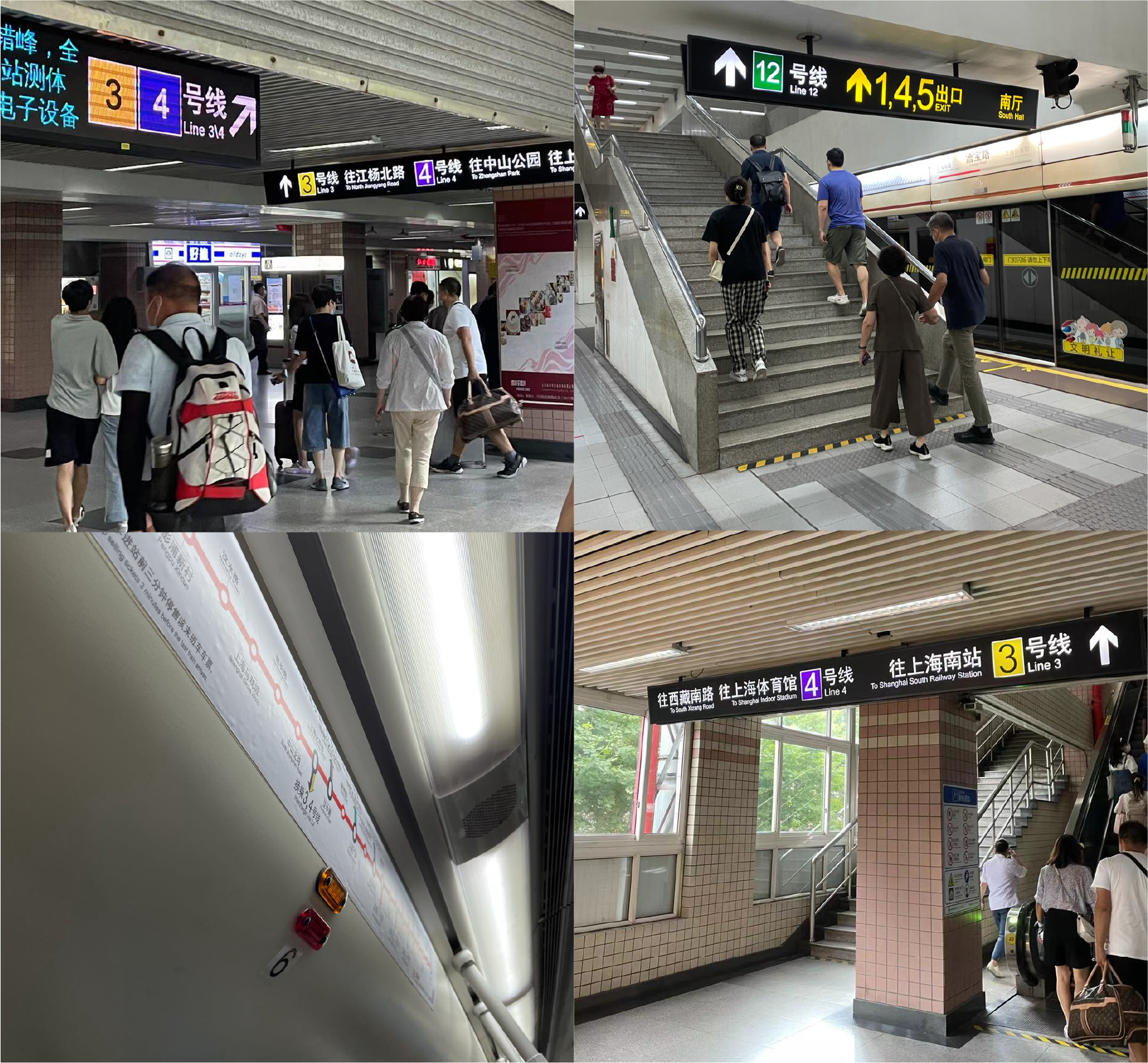
I went to several major transfer stations and observed sign patterns, locations, and designs. I also followed the typical passenger transfer route in the station to seek for potential opportunities.
- Some physcial signs are small and hard to see.
- Directional signs only showing terminal station and lack important transfer station information.
- Exit information is presented in yellow while other information is presented in white
research
User Interview
I interviewed several passengers and about their experience on the metro and their opinions about the visual guidance. I also interviewed station staffs to learn about passengers’ frequently asked question.
- Big transfer stations like Xujiahui Station is hard to navigate
- Some stations have complex layouts that require additional guidance
- Station staff are often asked questions about line directions and exit locations
Analysis
Persona
Profile
![]()
George Zhang
Age: 28
Occupation: Business Consultant

George Zhang
Age: 28
Occupation: Business Consultant
Background
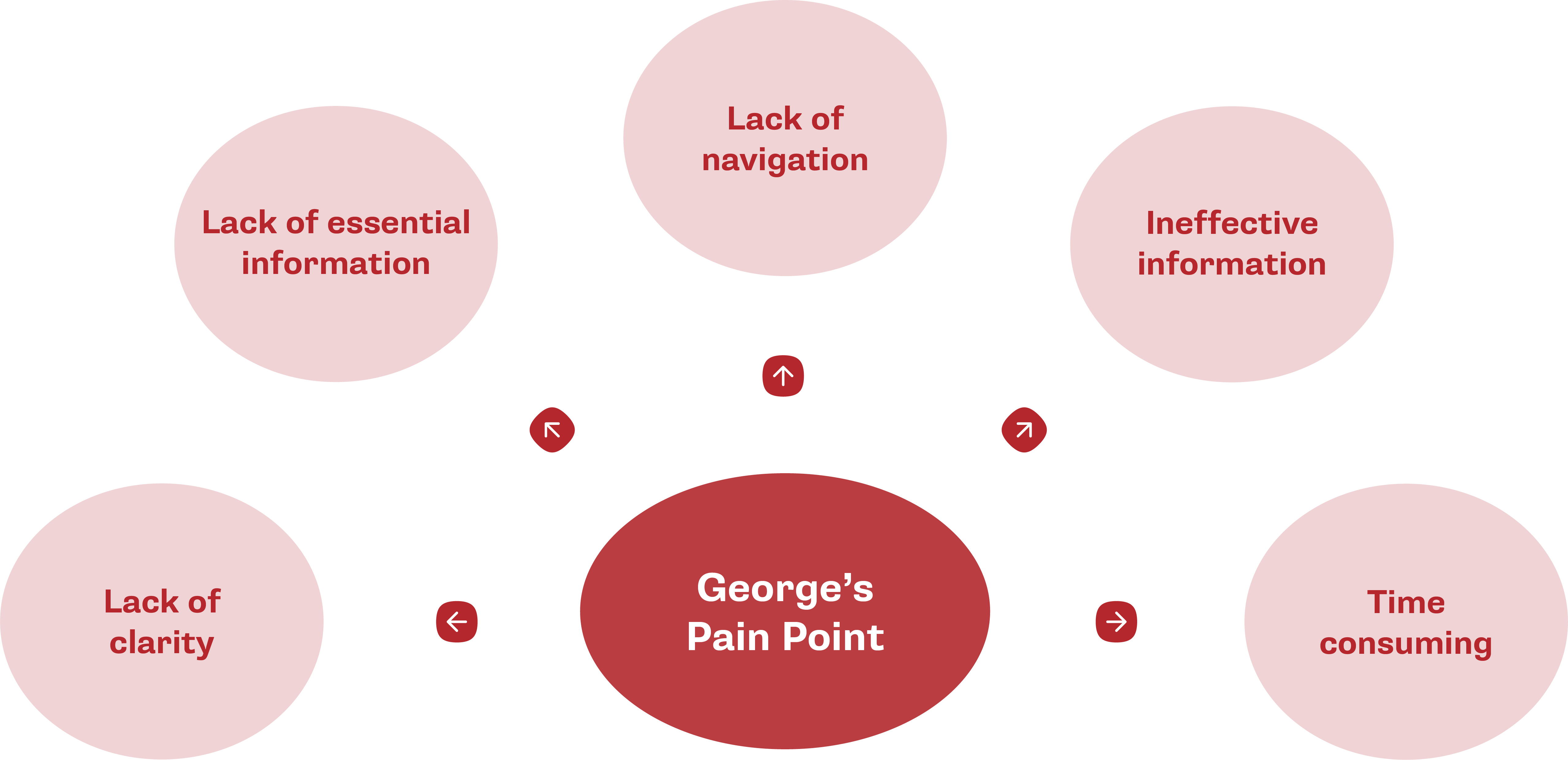
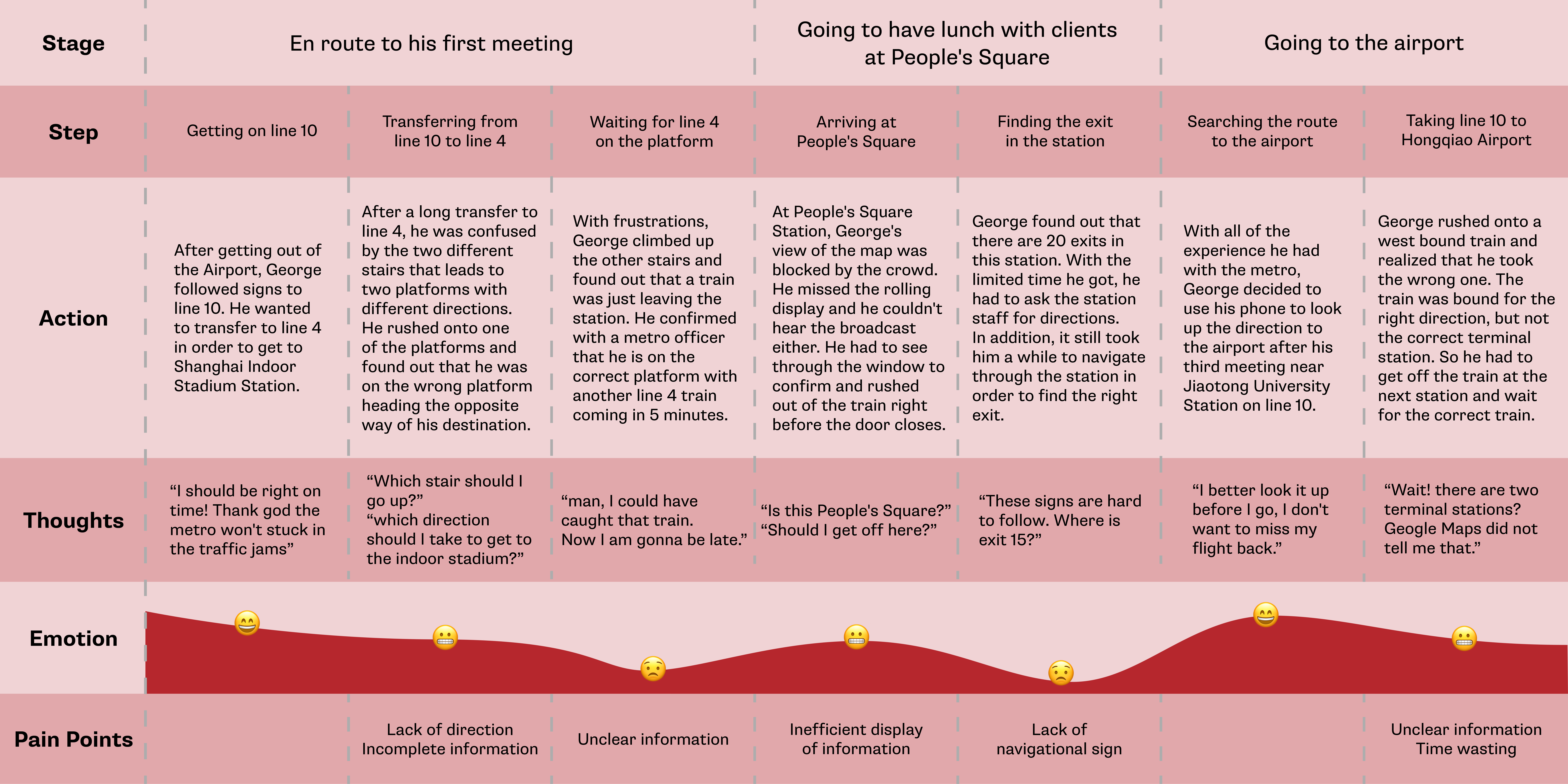
George travels to Shanghai for business trip twice a month and prefers to use metro as his transportation. He often experiences difficulties in finding exits in metro stations and sometimes takes the train bounding for the wrong direction. He also find it difficult to transfer in some stations that have multiple lines and hard to hear the broadcast in the train clearly.
George travels to Shanghai for business trip twice a month and prefers to use metro as his transportation. He often experiences difficulties in finding exits in metro stations and sometimes takes the train bounding for the wrong direction. He also find it difficult to transfer in some stations that have multiple lines and hard to hear the broadcast in the train clearly.
Scenarios
• Missed the train by a few seconds because wasted the time on trying to figure out directions
• Lost his direction in Century Ave. Station and thus losing time to discuss business issue with his partner
• Missed his flight from Hongqiao Airport because he got on the train that was bound for the same direction, but different terminal station.
Key Insights
Analysis
Empathy Map
What does he need to do?
- I want to be on time for my meetings with clients
- I want to transfer lines easily
- I dont want to get lost
What do they see and say?
- I missed the station name in the rolling display
- The display is not prioritizing important information
- I don’t know where I am going in large transfer stations
Pains
- Insufficient information in the station, on the platform, and in the train carriage
- Inefficient information delivery confuses passengers in the station.
What do they do?
- I follow the colored signs on the ground
- I followed the crowd to get out of the station
- I asked station staff for directions in rush situations
What do they hear?
- Very lengthy broadcast information
- Unclear onboard broadcast due to noises
- Closing door alarms go off
Gains
- Colored signs are easy to recognize
- Floor signs are easier to follow than wall signs
- The display of upcomings stations helps to determine directions
Analysis
Journey Map
Design Objectives
Recognition
![]()

Utilizing designated colors, scales and compositions for information presented in the metro station, help passengers to recognize different types of information and to navigate with ease.
Consistency
![]()

Improving the consistency of the visual guidance system by unifying the font, color, icons, and layout of information displayed. This will help passengers to find what they need with ease across all mediums and locations.
Priority
![]()
Simplifying information displayed at all locations and prioritizing the most important information for passengers, helping them to obtain crucial information when they are in a hurry.
Efficiency
![]()
Utilizing supplementary color, text and icons to improve the efficiency of information transmission. This will help to make the signs and displays easy to understand.
Design cONCEPT
1. Station Entry & Exit
Redesigning signs on the ground and ceiling to provide easy-to-follow directions to turnstiles and exits.
2. Station Level
Redesigning signs on the ground, walls, and ceilings to provide easy-to-follow directions to turnstiles, transfer halls, and other facilities in the station.
3. Platform Level
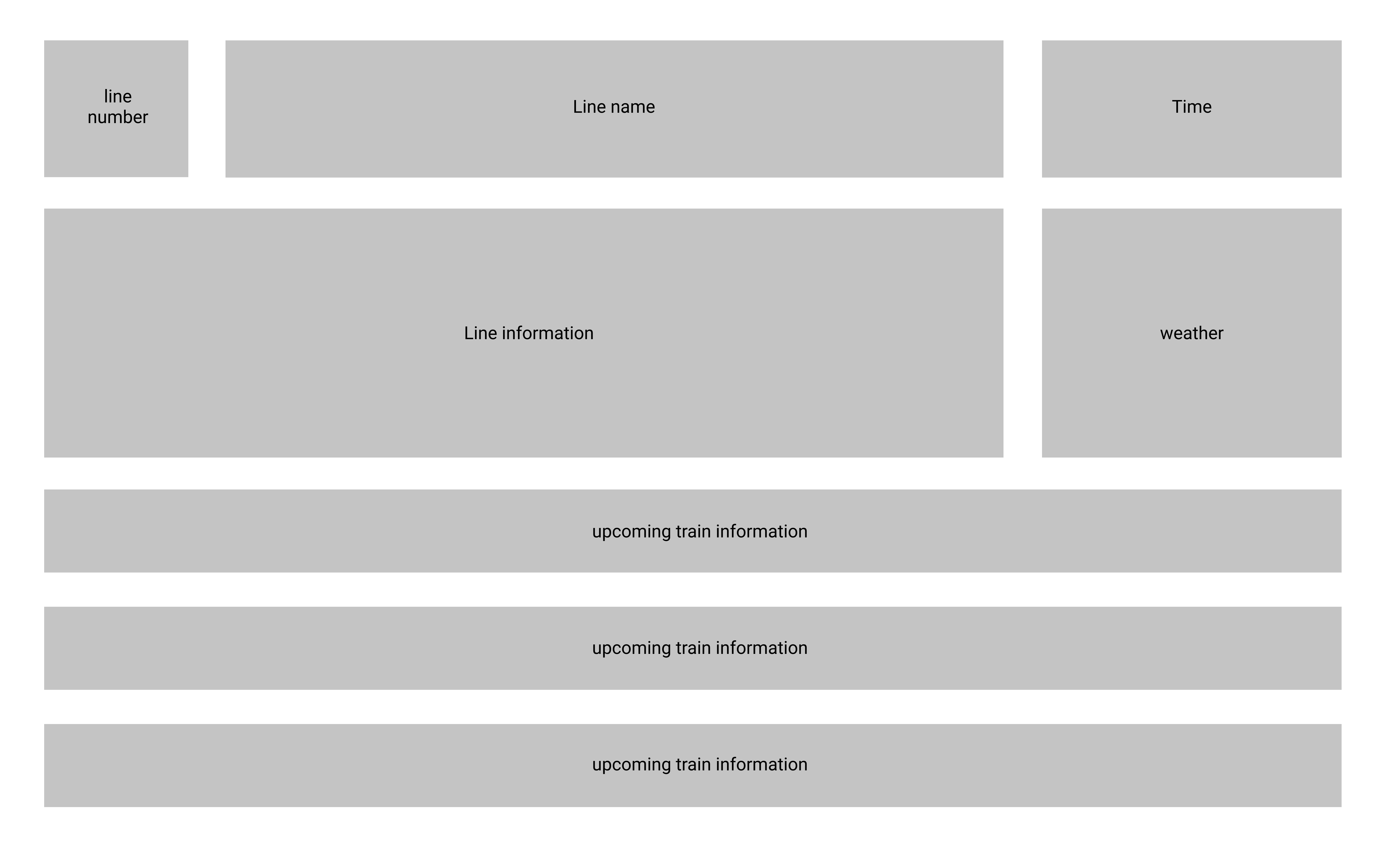
Designing digital display layout to provide specific train information for passengers. Redesigning signs on the ground and walls to provide clear directions to transfer hall and station level.
4. Metro Carriage
Designing onboard digital display to provide unified interface and clear information for passengers such as train direction, upcoming stations, terminal station, and transfer information.

Wireframe
Onboarding

Upcoming station

Line map

Arriving station information

Platform digital display
User testing
I performed user testings with some of my interviewees on my prototype and tried to look for potential opportunities for improvement.
Iteration 1
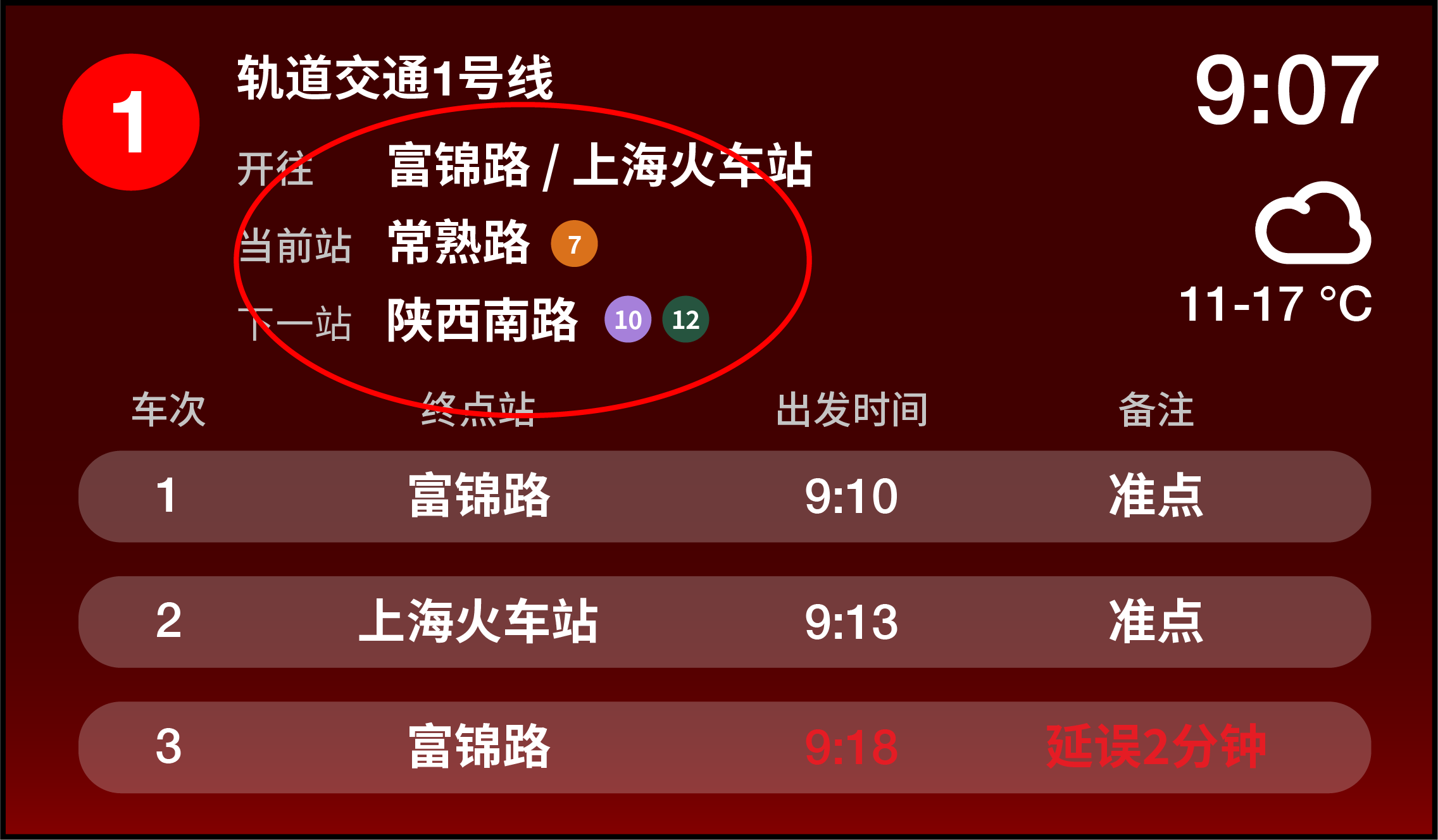
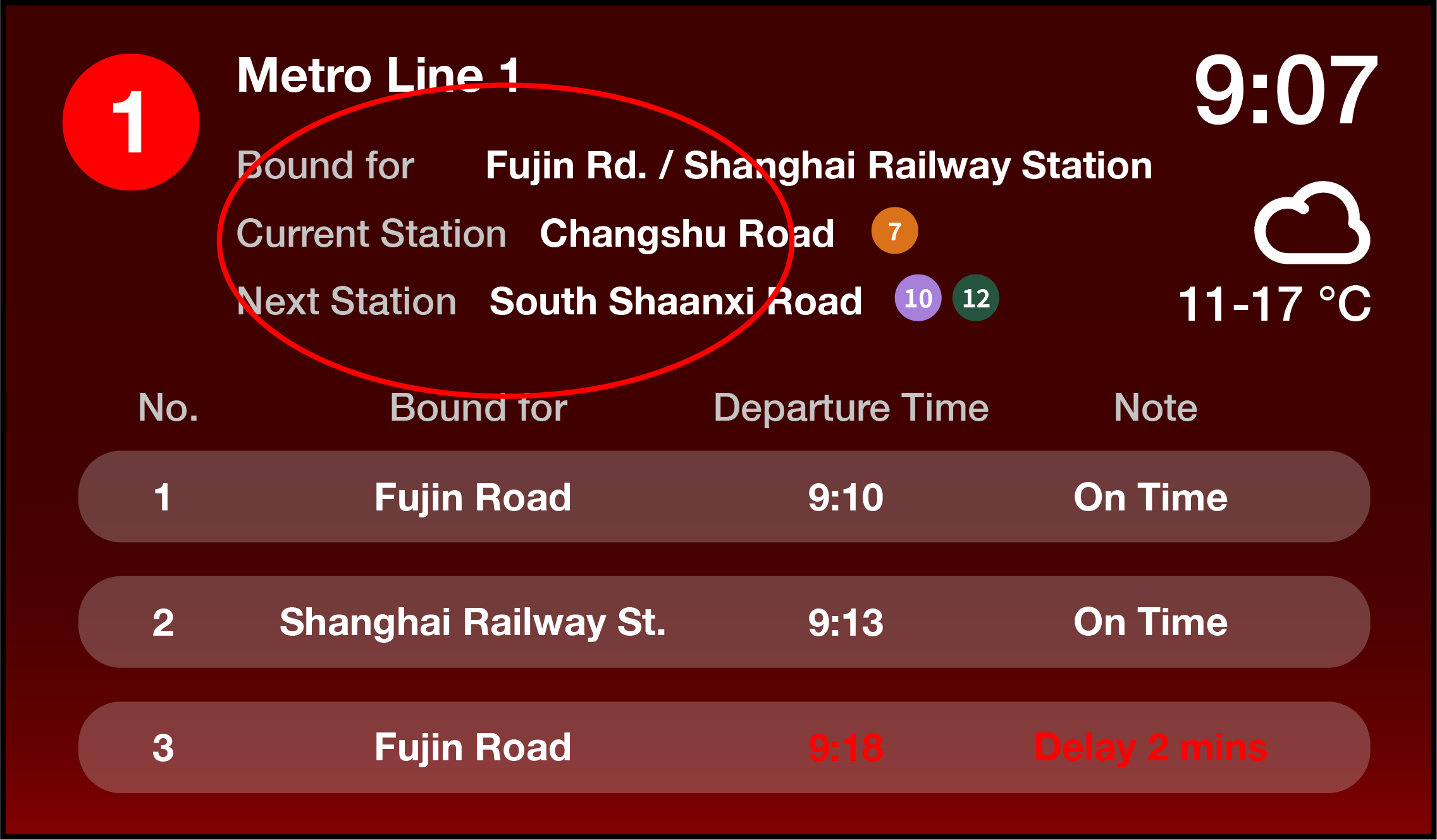
Users reported that line information are clustered and hard to see, espeically from distance.
I decided to seperate those inforamtion, spread them out horizontally on the upper half of the display, and highlight them with containers in iteration 2. These changes better utilize the empty space in the upper half of the display and help to make essential information easier to see.



Iteration 2
Users reported that red text are hard to see and the wording of “departure time” is confusing.
With these feedbacks in mind, I decided to use yellow to highlight the delayed train and add additional information of arrival time countdown. Both of these changes would help passengers to locate information they need with ease.


Final Design
vISUAL iDENTITY

Final Design
pLATFORM dIGITAL dISPLAY
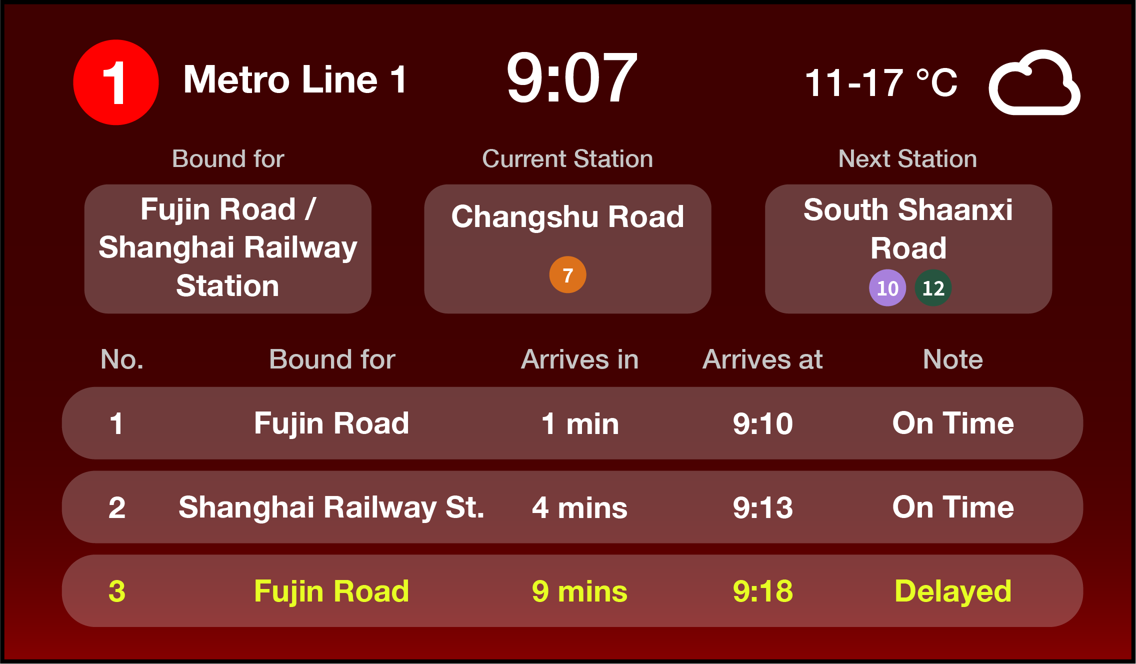
The final design of the refreshed platform digital display present various critical information seperately and prioritize legibility.


Final Design
Onboard dIGITAL dISPLAY LAyout
The final design of the refreshed onboard digital display fully utilized the width of the display to create information hierachy. With the continous display of information on the left and the rolling display on the right, passengers will be able to navigate with ease.

Final Design
oNBOARD dIGITAL dISPLAY cycle

Status: Train is stationary but about to leave.
Primary display (left): Displaying line number, terminal station, next station, and available transfers at the next station.
Secondary display (right): Displaying current station name, door-opening status, available transfers at the current station, and carriage number.


Status: Doors are closed. Train is departing.
Primary display (left): Displaying line number, terminal station, next station, and available transfers at the next station.
Secondary display (right): Displaying upcoming stations and available transfers at each of the upcoming stations.


Status: Train is in transit.
Primary display (left): Displaying line number, terminal station, next station, and available transfers at the next station.
Secondary display (right): Displaying the entire line map and available transfers at each station.


Status: Train is slowing down and arriving
Primary display (left): Displaying line number, terminal station, arriving station, and available transfers at the arriving station.
Secondary display (right): Displaying current carriage number and door-opening status.


Status: Train is stationary. Doors are about to open.
Primary display (left): Displaying line number, terminal station, arrived station, and available transfers at the arrived station.
Secondary display (right): Displaying detailed station information about the arrived station, along with carriage number and door-opening status.


Status: Train is stationaty. Doors are opened.
Primary display (left): Displaying line number, terminal station, next station, and available transfers at the next station.
Secondary display (right): Displaying arrived station name, door-opening status, available transfers at the arrived station, and carriage number.


Takeaways
Information hierachy
Throughout this project, I have recognized the power of
Information hierachy. The order of the information, typography, font size, color, and composition all play critical roles in creating a streamlined experience for users. A small change in the way information is presented on the platform digital display would completely change users’ experience, allowing them to receive important information quickly. I would defenitely carry these learnings over to my future projects.
Next steps
If I were to continue working on this project, I would like to perform a more extensive user testing for the entire visual system
to test the potentials of my informed design solutions. I would reach out to the Shanghai Metro management team and ask for permission to test my designs in an actual station. The real world test would allow me to further understand how passengers may interact with information on different mediums.