PARKSIDE CAFE Mobile App
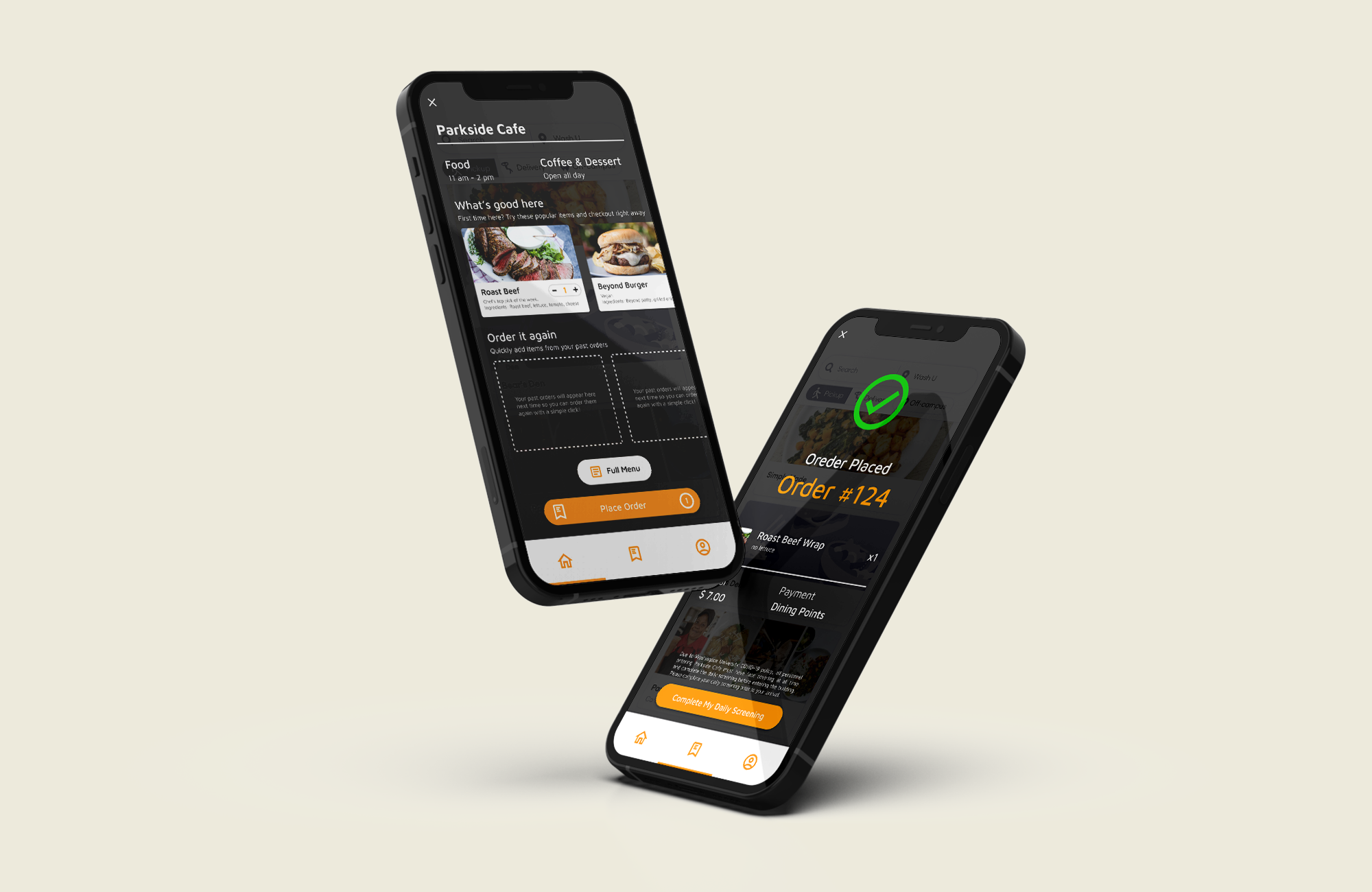
An online ordeirng experience designed for first-time users within the Washington University community to get onboard with the service and save time during busy hours.
Overview
Duration:
October 2021 – December 2021
(10 weeks)
October 2021 – December 2021
(10 weeks)
Tools:
Figma
Adobe Illustrator
Figma
Adobe Illustrator
Skills:
UI/UX Design
User Research
User Testing
Prototyping
UI/UX Design
User Research
User Testing
Prototyping
The addition of Parkside Cafe to the Washington University campus three years ago was beneficial to all members of the University as it provides various food options and mobile ordering. However, the lack of introduction caused confusions and frustration when people first start to try it out. In this project, I am looking to improve users’ onboarding experience under the university’s COVID-19 guidelines.
Results & Impact
(If implemented)
- Would help 2k+ incoming students to get onboard with this digital experience quickly
- Would save time for 20k+ current students during their lunch break
- Would intergrate updated COVID-19 policy and streamlined the entire mobile ordering experience
Solution Highlights
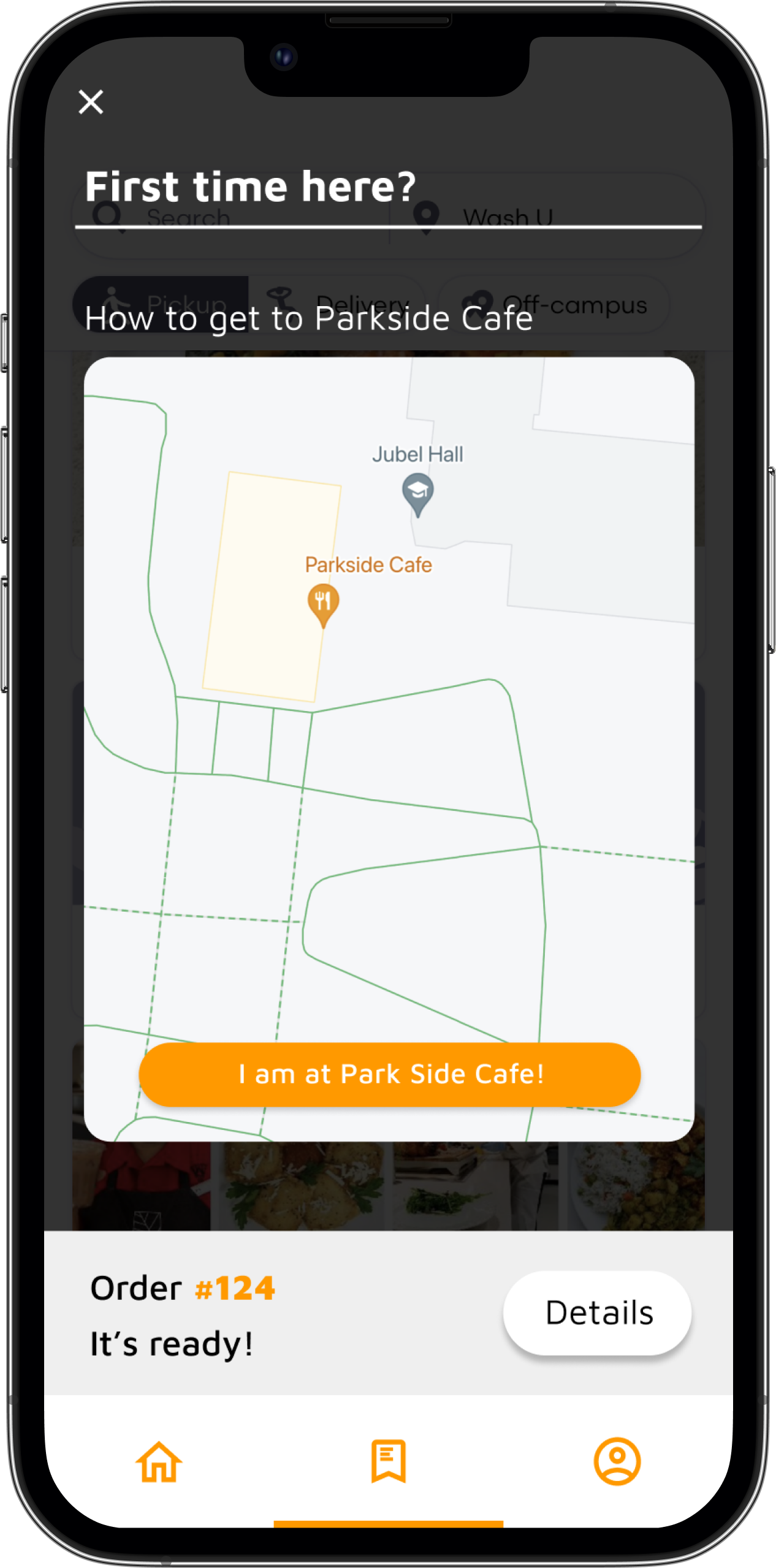
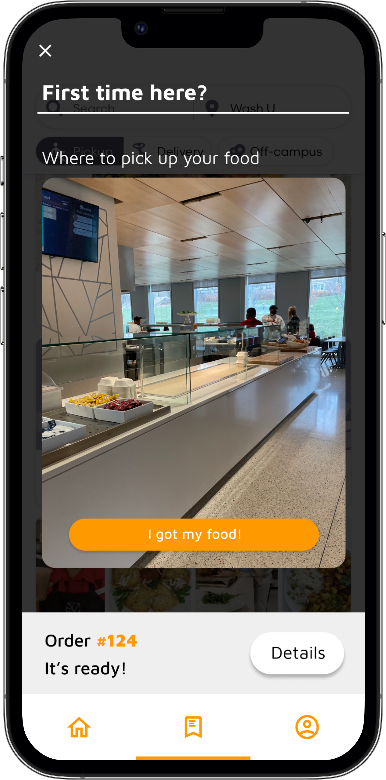
Onboarding & ordering experience
Background
Parkside Cafe, located at the east end of the Washington University campus, was one of the newly introduced dining facilities since 2019. The addition of Parkside Cafe provided more food options and mobile ordering, making it accessible and convenient for students and faculties working on the east end. However, the introduction of the new facility also presents a problem. Its feature of mobile ordering was never utilized elsewhere on the campus. In addition, the newly implemented COVID-19 guilelines further limited the accessibility of this Cafe. Such limitations might prevent first time users from fully utilizing the facility.
Target Audience

research
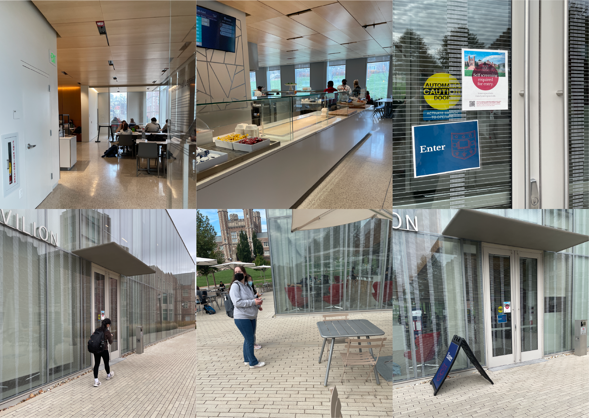
Field observation
I went to Parkside Cafe and observed how people interact with the physical space, both inside and outside, to find underlying problems.
- Students often stood in the door way to complete COVID-19 screening, causing blockage
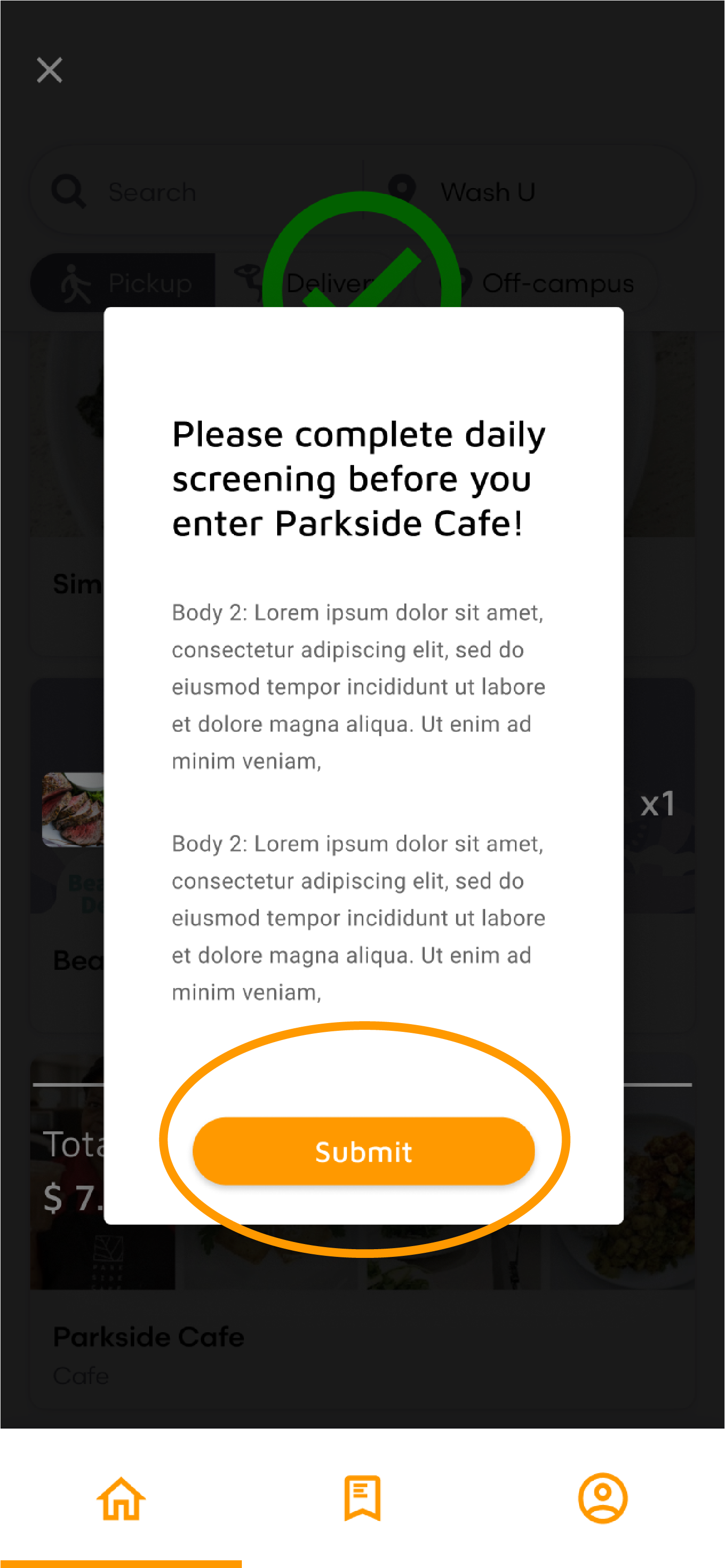
- Lack of visible signs that reminds students to clear their daily COVID-19 screening
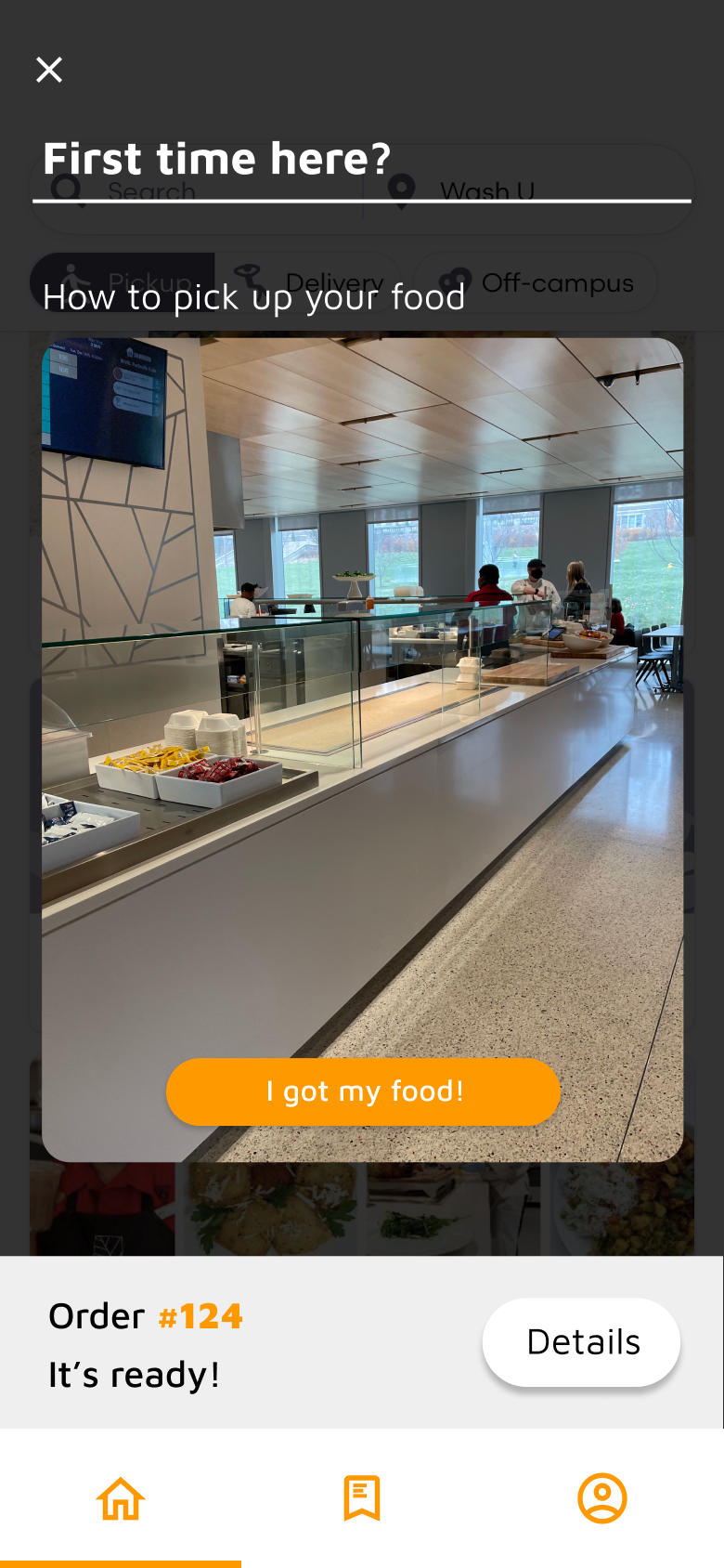
- Lack of instruction for order pickup
research
User Interview
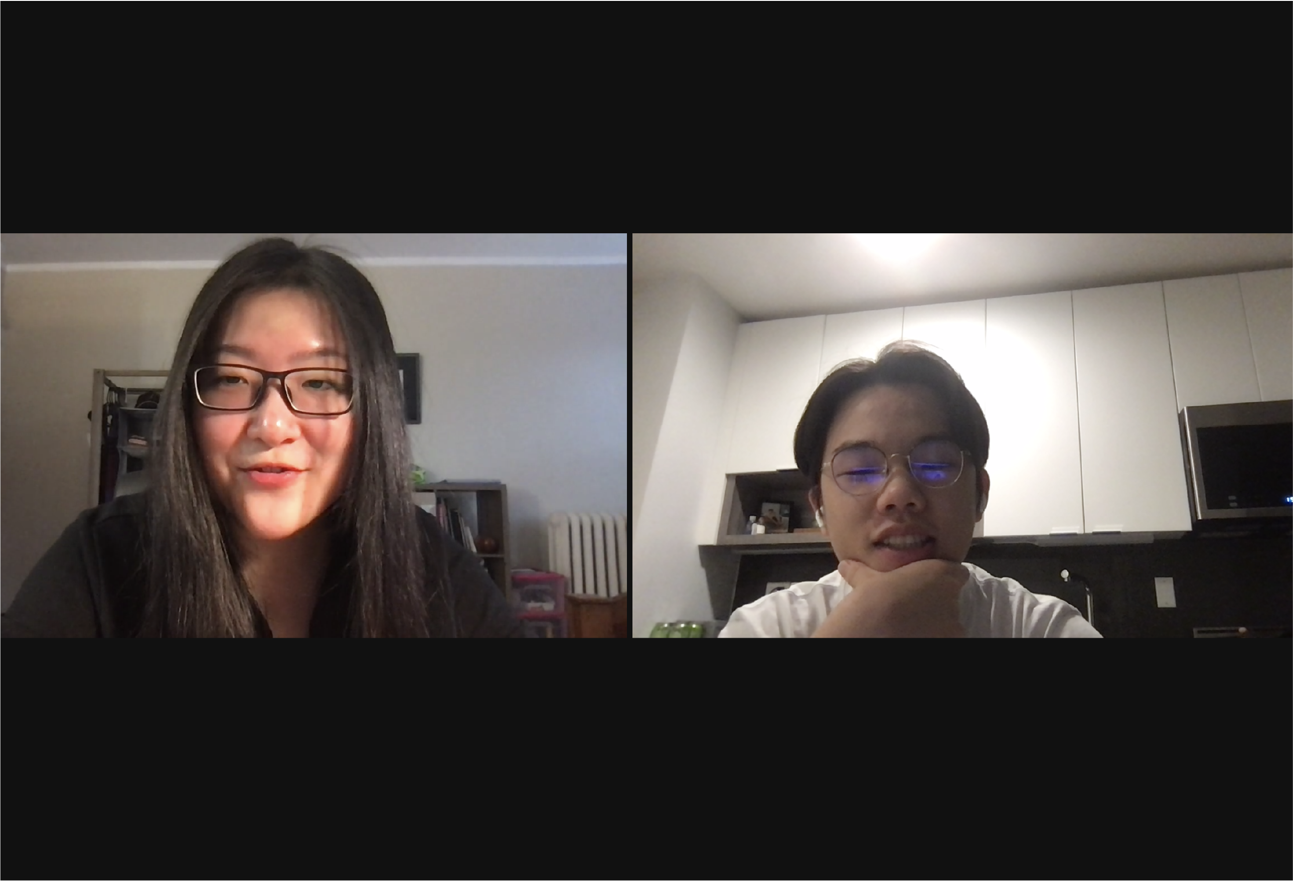
I collaborated with two fellow student designers to conduct interviews with 12 students. We asked them to recall their first-time experience with the Cafe, as well as how they responded to the new COVID-19 guideline.
- Students did not know how to use the app
- Students didn’t know where to pick up
- Students thought order tracking is helpful
Analysis
Persona
Profile
![]()
Chris
First-year student majoring in Business and Communication Design

Chris
First-year student majoring in Business and Communication Design
Schedule
Business School – Parkside Cafe – Studio
Business School – Parkside Cafe – Studio
Needs
To be able to grab lunch and get to his studio class in 20 minutes
To be able to grab lunch and get to his studio class in 20 minutes
Profile
![]()
Sasha
First-year BFA student majoring in Fashion Design

Sasha
First-year BFA student majoring in Fashion Design
Schedule
Studio - Parkside Cafe - Studio
Studio - Parkside Cafe - Studio
Needs
Wants to check out the new Cafe and enjoy the recommended food options
Wants to check out the new Cafe and enjoy the recommended food options
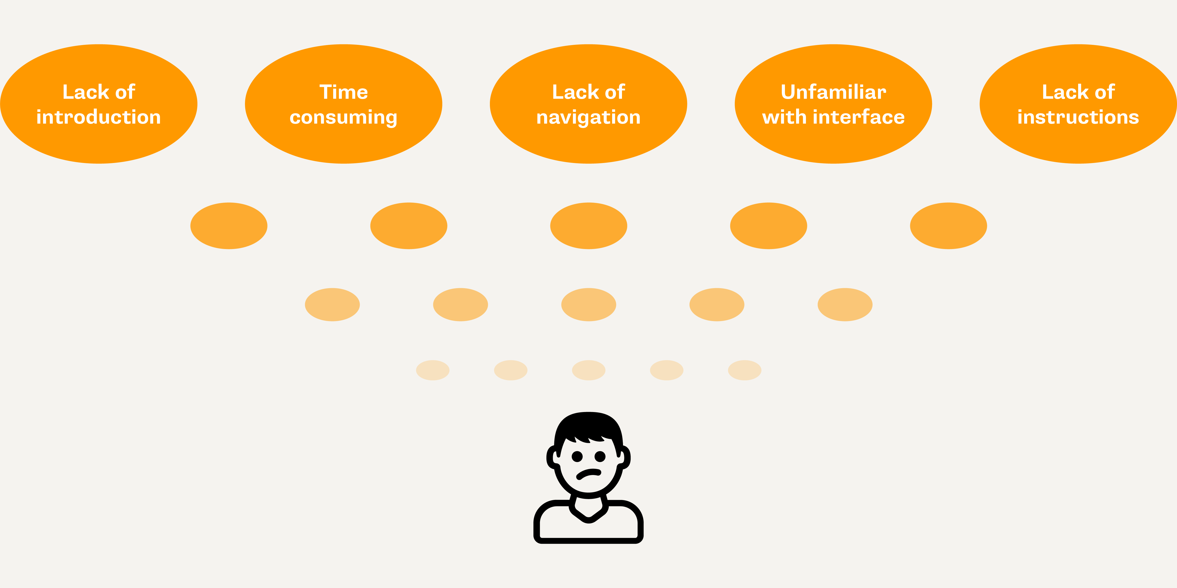
Key Insights
Analysis
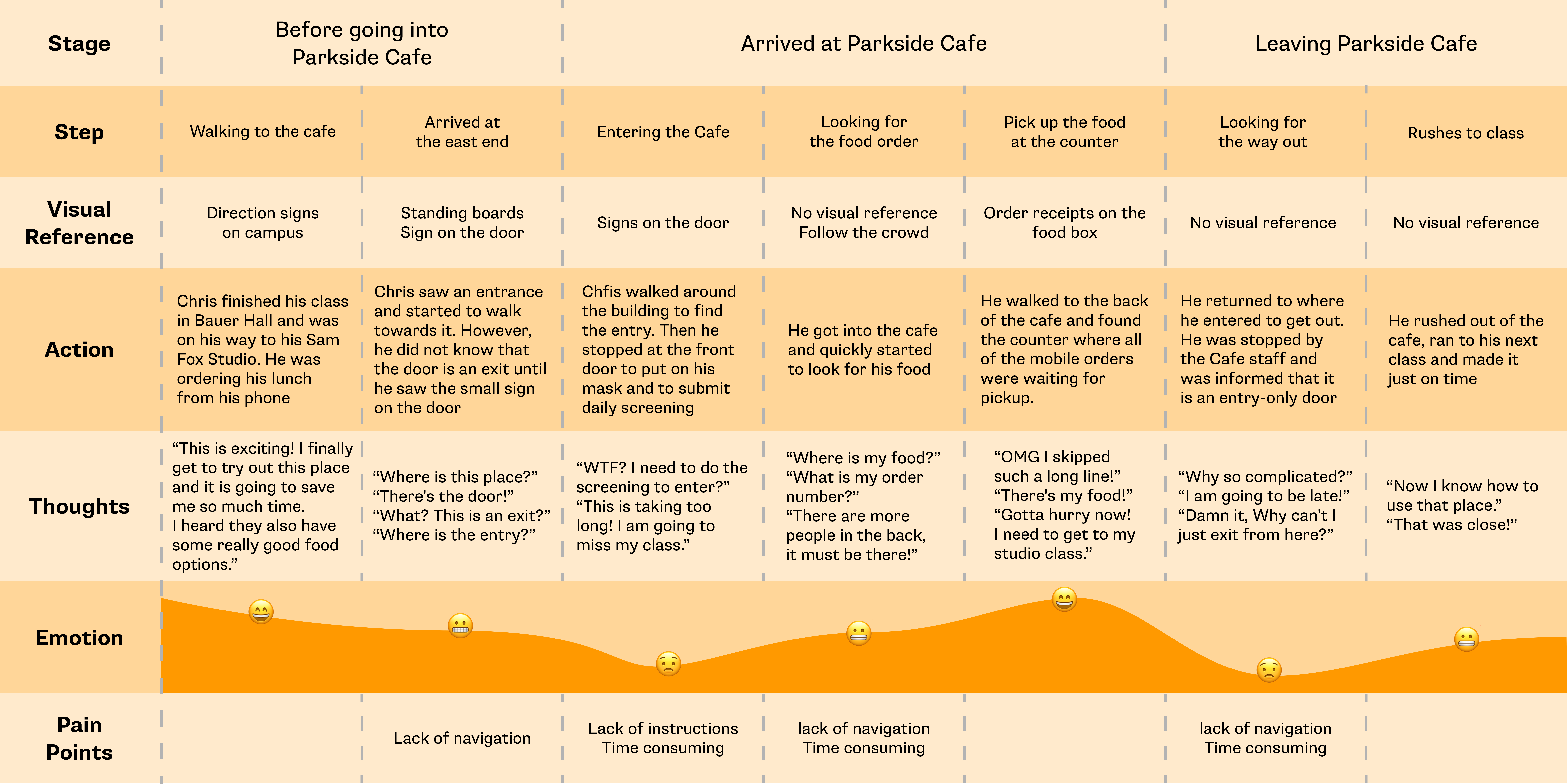
Journey Map
Analysis
Empathy Map
What do they do?
- Ask friends about what’s good on the menu today
- Scan the QR code to do screening in front of the entrance
- They walk around the Cafe to find their food
What do they see and say?
- People standing outside to finish daily screening before they enter the Cafe
- Sorry, I don’t know my order number
- Where do I pick up my food?
Pains
- Confusion about where to pick up food
- Indecisive on what they want to order
- Wasting time while trying to finish screening
What do they hear?
- They hear staff asking for daily screening results
- They hear staff calling order numbers
- They hear students complain about complicated procedures
What do they think?
- They want to try out new food options on campus
- They wish the process can be faster
- They wish to get rid of daily screening checking
Gains
- Saving time in between class
-
Tracking when food is going to be ready
- Being able to order beforehand
- Recommended good food options
Design Objectives
Intergration
![]()

Intergrating daily screening and navigation functions into the app, helping users to find their food quickly
Introduction
![]()

Introduce the Cafe and the app interface with landing page so users can navigate both with ease
Simplification
![]()

Streamline the ordering process for first-time users so they can order food items quickly and conveniently
Wireframe
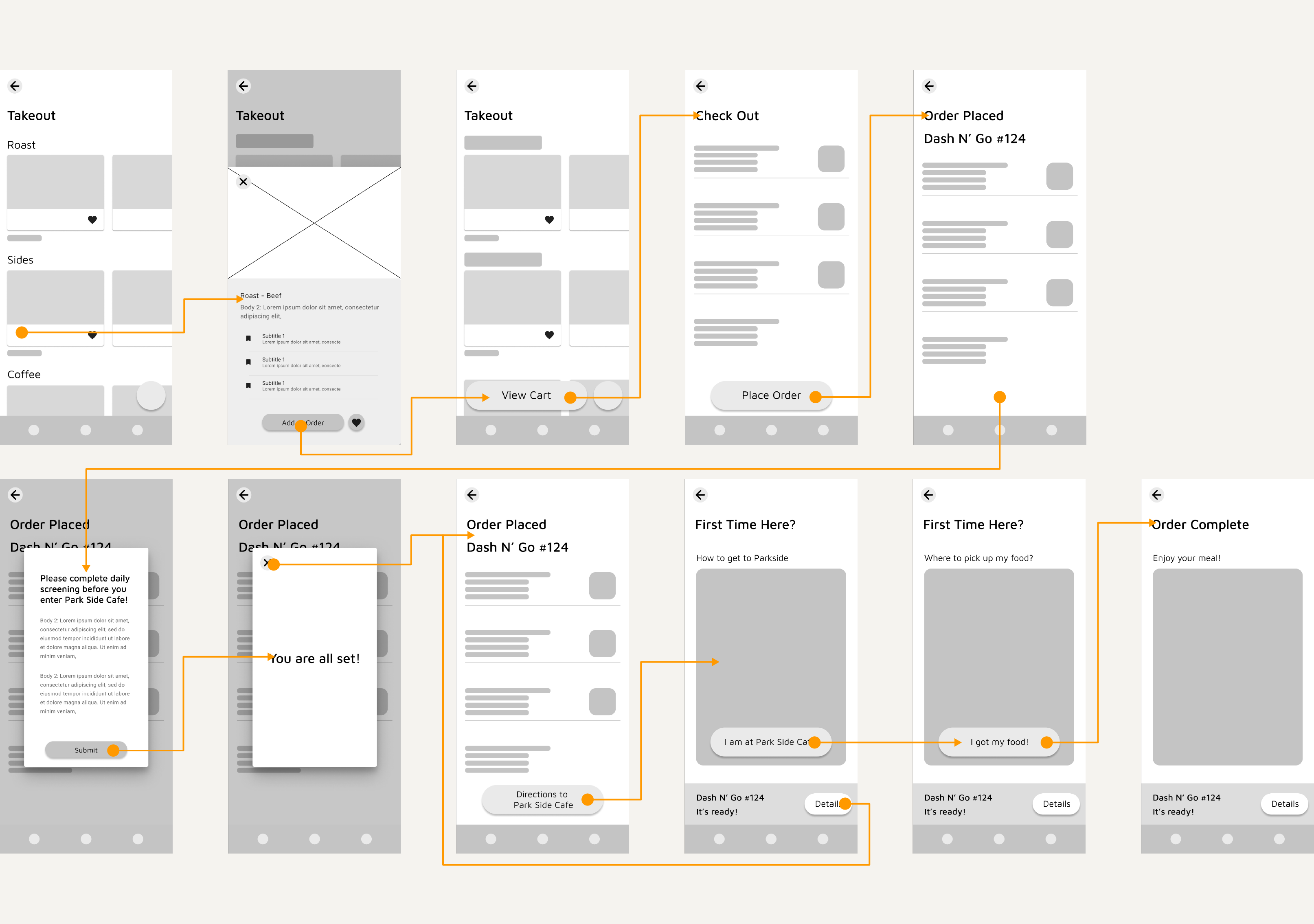
Design Decisions

Continued to utilize the visual identity of Grubhub, like the orange color and page layout to reduce confusion and help users to be familiar with the addition of interfaces faster.

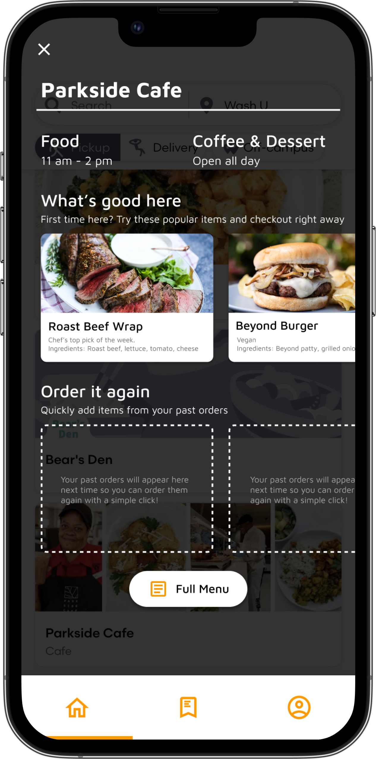
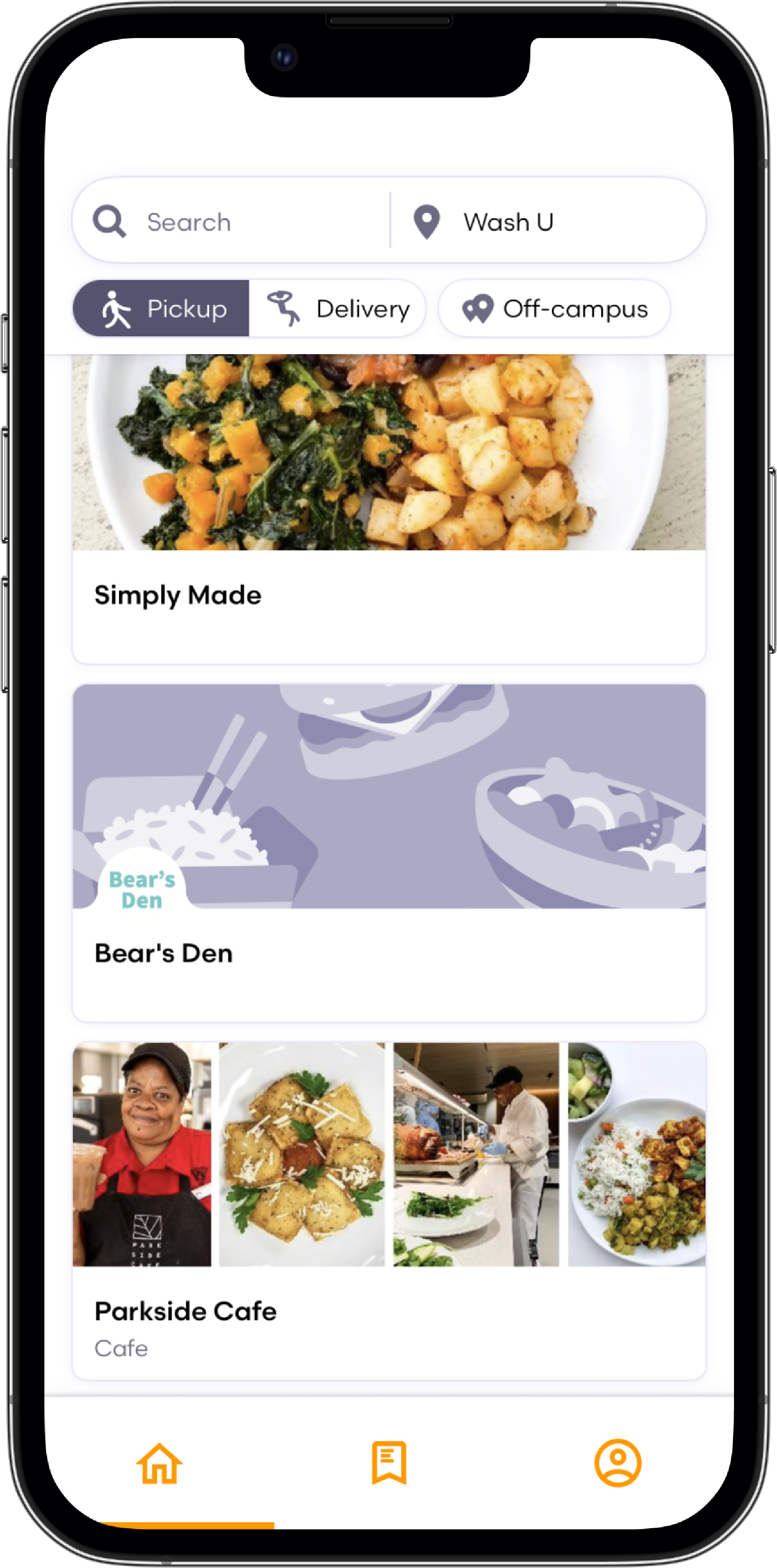
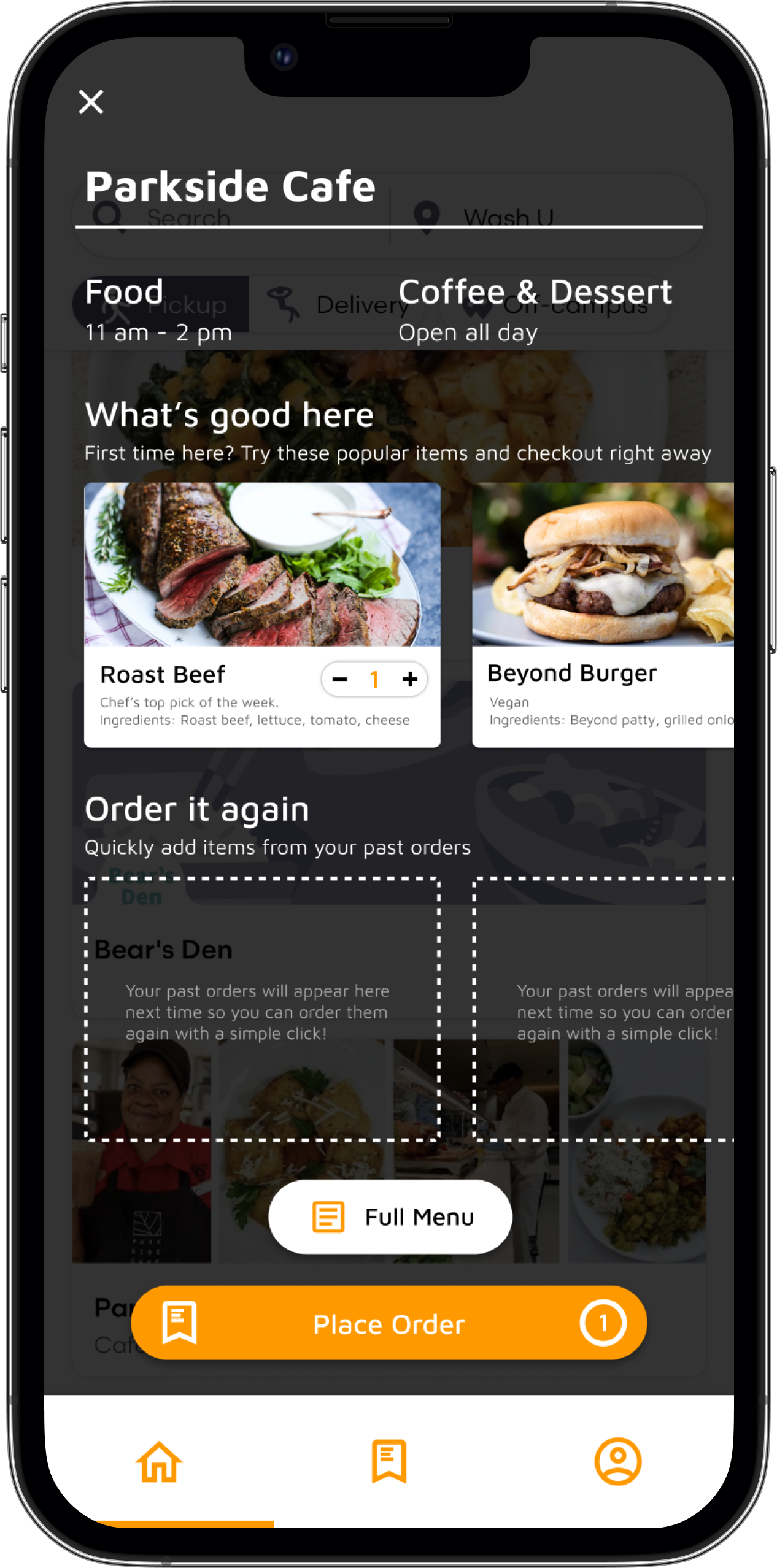
Added more detailed operation information and recommended food items to the landing page to provide a more extensive onboarding experience.

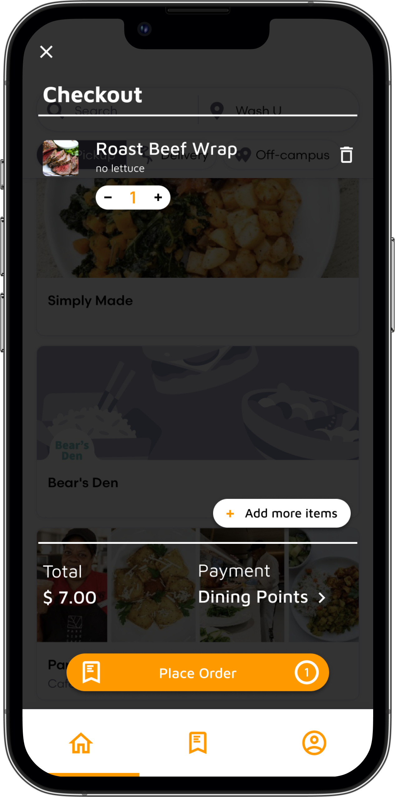
Placed the big orange button at the bottom of the screen for accessibility and ease of control since the thumb would naturally rest at that position when people hold their phone.

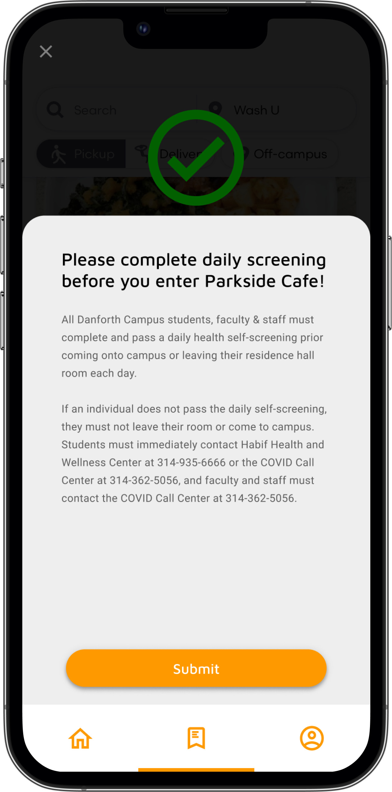
Utilized complimentary texts to introduce different functions and COVID-19 guidelines, helping users to understand additional requirements and get used to different sections.
Design Iteration 1
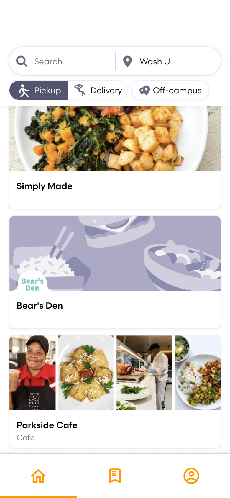
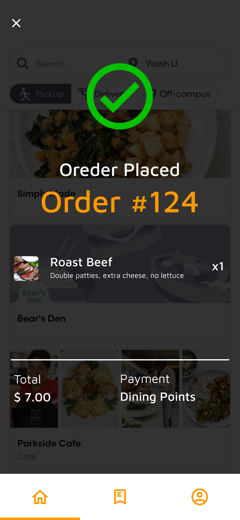
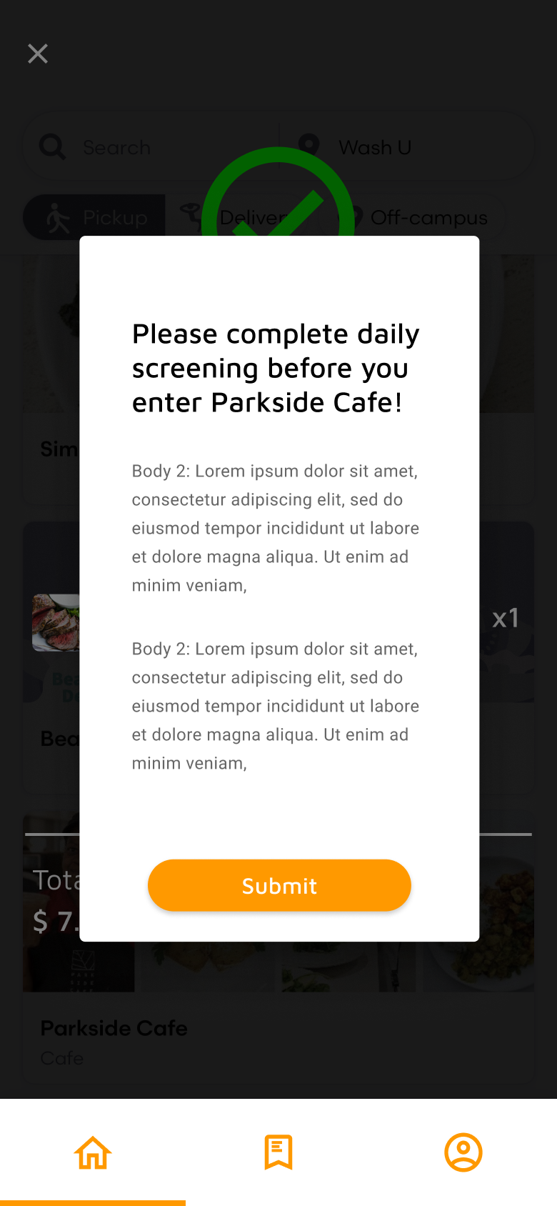
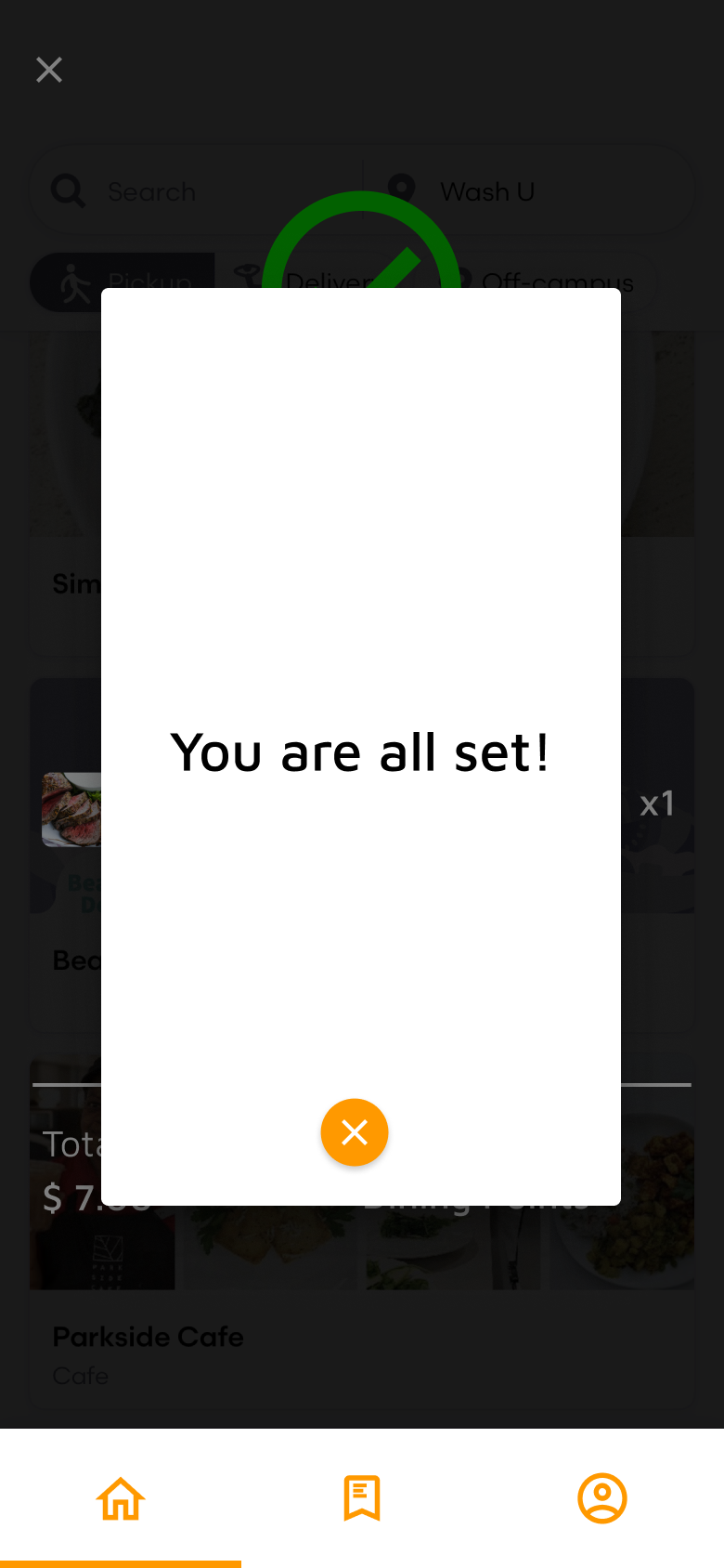
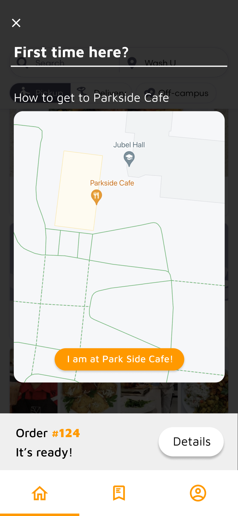
Iteration 1 User testing
I performed user testings with my interviewees on my prototype and tried to look for potential opportunities for improvement.
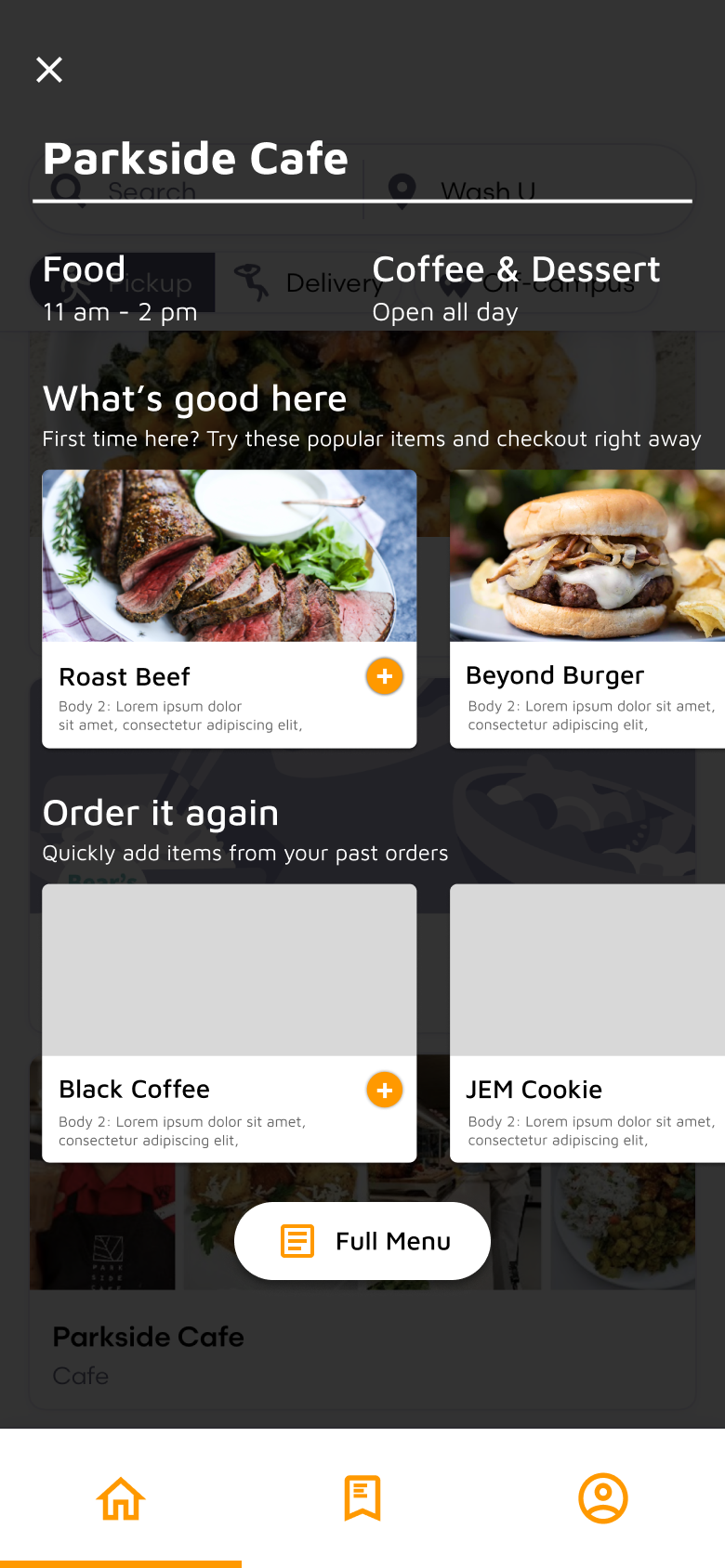
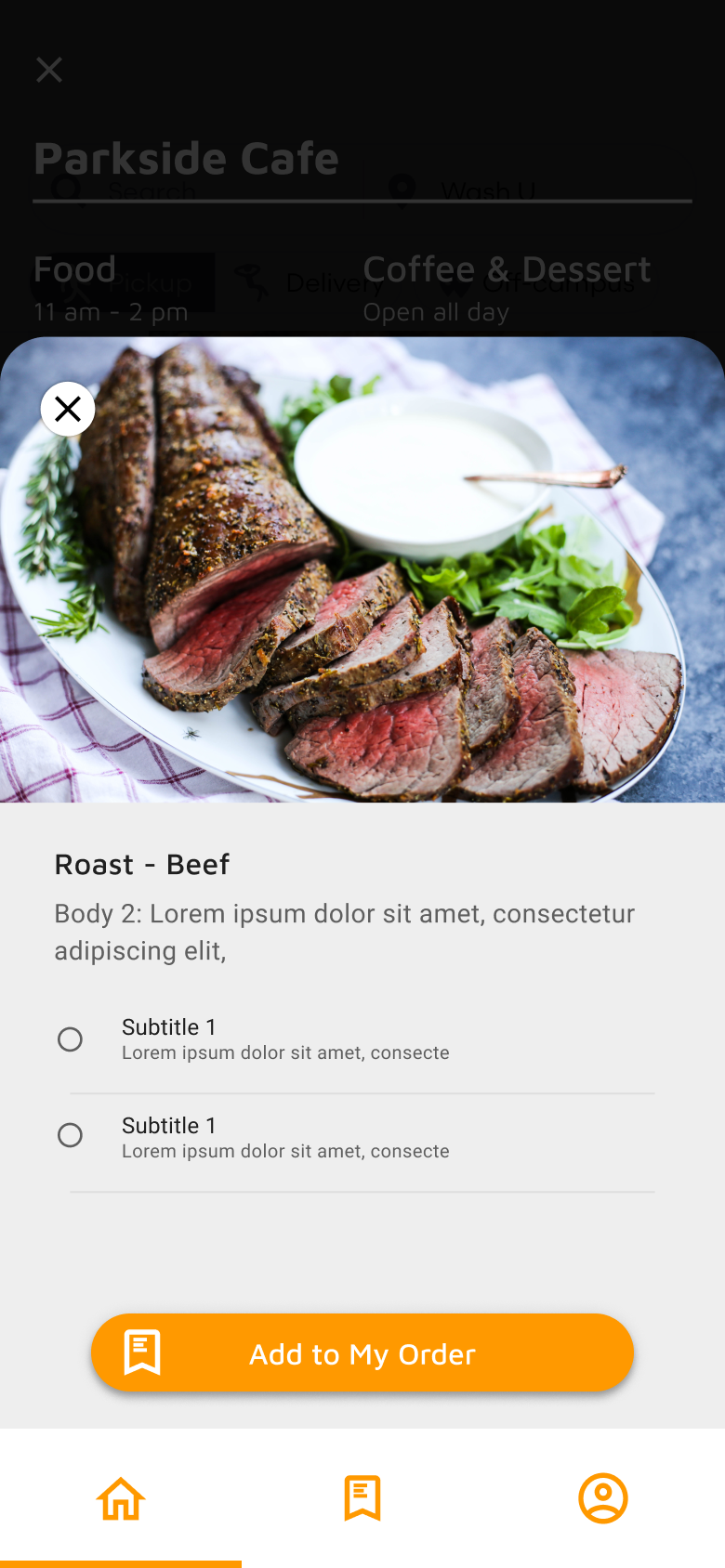
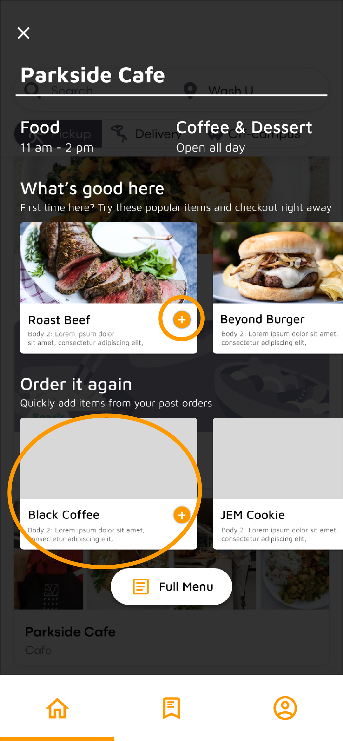
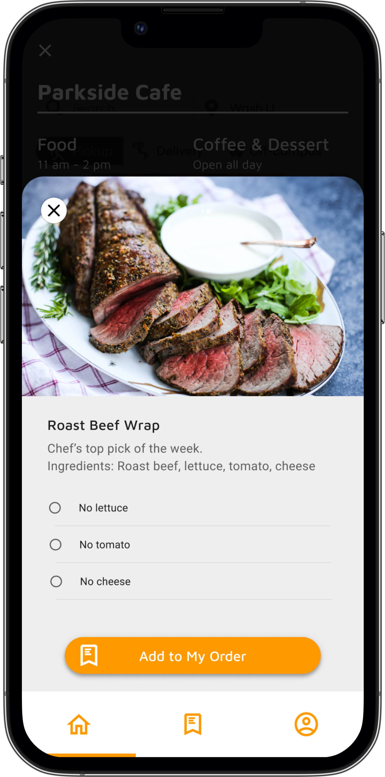
- The “plus button” caused confusion during my user testing. Half of the people wanted to use it to expand the item to learn more while the other half wanted to use it for adding the item to their order. In the end, I decided to remove it to simplify the process.
- Participants suggested that instead of showing a potential past order, an explanation of what to expect in the section would be helpful for first-time users to get used to the app interface.
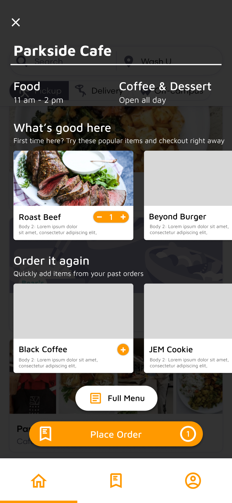
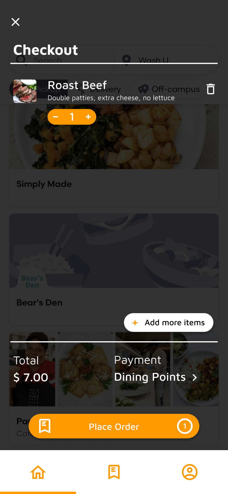
- Participants reported that the orange button is very effective and easy to use, but they would prefer it to appear in the same position. So I decided to extend the presence of this orange button and to unify its size across all screens.
- I also positioned it at the bottom of the screen with the only exception of the navigation section since participants reported that they would prefer to have their order information presented at an accessible location.
Final Design
Onboarding Experience
Landing Page
Landing Page

Menu / Order
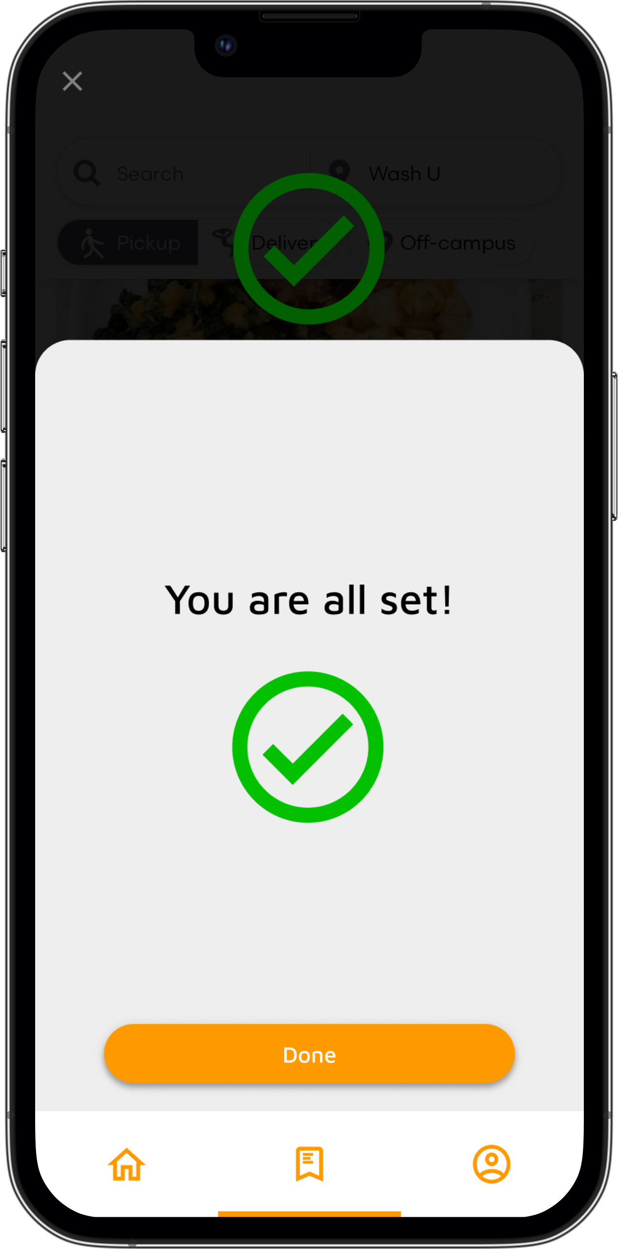
Check out


Daily screening

Directional guidance
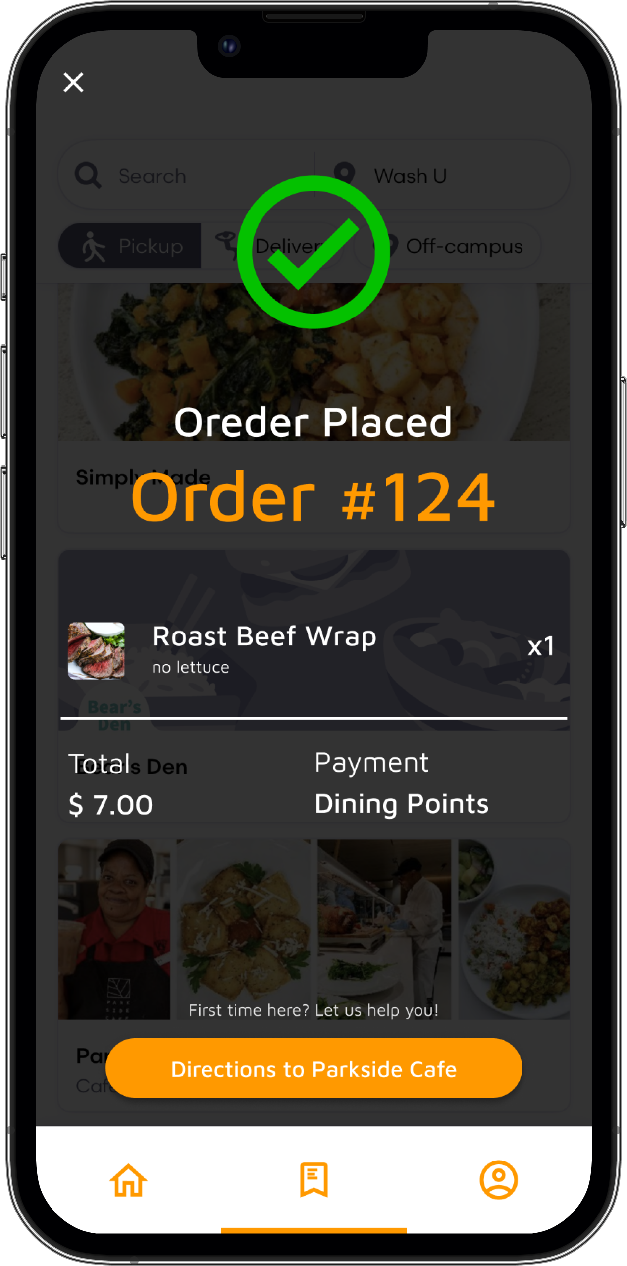

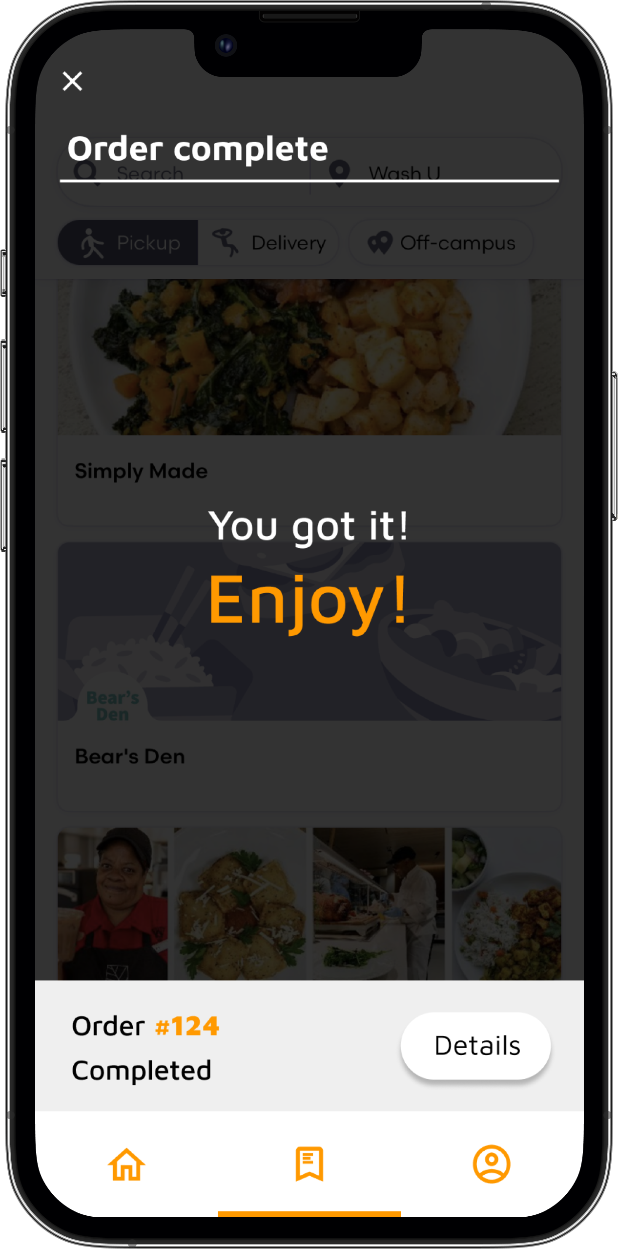
Order pickup

Takeaways
Power of details
During the user test, I was surprised to find that buttons, something that we are so used to seeing and are so unsubstantial, are really powerful in directing user flow and streamlining the user experience. The placement and design of these micro-interactions will defenitely be something that I will keep in mind for future projects.
Next steps
If I was to continue working on this project, I would like to perform user testing on a wider range of people. I would like to reach out to incoming student and to gain some valuable feedback from first time users. I also want to see if I can push my design further to accommodate other users’ need. Some of the users I tested my prototype with have dietary restrictions. How could the design of menu and ordering process adapt to their need?